Why the Tasuki Owl Won — Scoring 4 Mascot Candidates on 3 Axes
Choosing the mascot, structurally
When I picked Tasukiba’s mascot, I went through structured comparison, not gut feel.
As A-5 covered, the mascot is a device that communicates the service’s temperature wordlessly. The decision attitude was set early: “not because it’s cute.”
This is bonus chapter M-1. The four-candidate comparison, with the judgment logic written out in matrix form.
Selection criteria
Four criteria, set up front:
- Fit with the product’s three axes (knowledge / project management / security)
- Trust in enterprise adoption context
- Affinity with security-first contexts
- Palette and motif harmonizing with the full UI
The first was the heaviest weight. Whether the mascot’s symbol overlaps with the product’s three axes without forcing the fit was the priority.
The four candidates
Candidate 1: Owl
| Aspect | Detail |
|---|---|
| Symbol | Wisdom (Greek myth, Athena’s sacred bird) / memory (sees in the dark) / protection (household guardian) |
| Palette feel | Navy, deep blue, restrained |
| Enterprise fit | ◎ communicates calm and trust |
Candidate 2: Lighthouse
| Aspect | Detail |
|---|---|
| Symbol | Wayfinding (illuminating information) / stability (stays put, protects) / light at night |
| Palette feel | White + red / orange accents |
| Enterprise fit | ◯ but reads as “infrastructure,” drifts from the knowledge-management context |
Candidate 3: Open book
| Aspect | Detail |
|---|---|
| Symbol | Knowledge (directly) / learning / transmission |
| Palette feel | Brown / green |
| Enterprise fit | ◯ but tends to read as education/learning service, cliché in business-SaaS context |
Candidate 4: Abstract geometric (arrow + circle)
| Aspect | Detail |
|---|---|
| Symbol | Baton handoff (arrow) / protection (circle) / modern |
| Palette feel | Flat, minimal |
| Enterprise fit | ◎ but lacks warmth, doesn’t carry the “third place” temperature |
Three-axis matrix
The four candidates mapped to the product’s three axes:
| Product axis | Owl | Lighthouse | Book | Geometric |
|---|---|---|---|---|
| Knowledge management (wisdom, memory) | ◎ | △ | ◎ | △ |
| Project management (watching over) | ◎ | ◎ | × | ◯ |
| Security (guardian) | ◎ | ◎ | × | ◯ |
— only the owl scored ◎ on all three axes.
Plus:
- Trust for enterprise adoption is highest (heavier than book / geometric)
- Approachability when personified exists (warmer than lighthouse / geometric)
- Plenty of copy hooks (“watching at night,” “guarding knowledge,” “showing at the moment of need”)
A single motif that holds the firmness of business SaaS and the softness of community at the same time. Only the owl pulled that off.
”Isn’t an owl too stiff?”
“Owl = wisdom” is a heavy motif in education and academia. I worried about “too stiff for business SaaS” initially.
But as A-5 noted, the owl carries a dual symbol — wisdom + protection across multiple cultures.
- Greek myth (Athena’s sacred bird = wisdom)
- Roman culture (sage symbol)
- Japanese culture (the “without hardship” homophone = protection)
That duality lets the same icon hold business-SaaS firmness and community softness simultaneously. Same reasoning as “ambiguity used by domain” in A-3. A single symbol that holds multiple meanings is a strong option.
The name “Tasuki Owl”
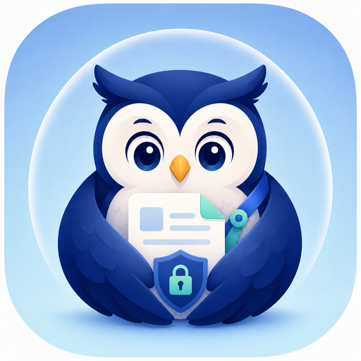
Service name Tasukiba (place of baton handoff) + owl = Tasuki Owl.
An owl carrying a tasuki (relay baton), passing knowledge from past to future. Meaning arises both in the word and the image.
Design elements — each has meaning
The general-purpose version (mascot-owl-source.png, 1254×1254 PNG) composition:
| Element | Meaning |
|---|---|
| Navy base | Trust, calm, watching at night |
| Wings cradling a document | ”Guarding knowledge,” “passing to the next judgment (= tasuki)“ |
| Shield + keyhole on chest | Security, permissions, tenant isolation |
| Background circular barrier (pale blue) | Protection, safe zone |
Every element maps 1:1 to a design intent. Every element answers “what is this for?” if asked.
Why navy blue
Palette: navy base.
Reasons:
- Trust — heavily used in business SaaS (Microsoft / IBM / SAP)
- Calm — not loud, doesn’t tire eyes over long sessions
- Night metaphor — visualizes “watching at night”
Alternatives I considered:
| Color | Evaluation |
|---|---|
| Green | ”Freshness” yes, but business-SaaS trust weakens |
| Purple | ”Premium” yes, but too rigid |
| Red | ”Passion” yes, but reads as warning, misreading risk |
Navy is, in some sense, the most “boring obvious choice.” For business SaaS, that’s the right answer.
Decision: don’t push the mascot loudly
Tasukiba doesn’t push the mascot loudly:
- No animation
- No over-anthropomorphization
- No tilt toward cuteness
Reasons:
- Doesn’t damage enterprise trust on adoption
- Consistent with the tidy-UI philosophy from A-3
- Long-term: doesn’t fatigue
As A-5 said, the Tasuki Owl is “the device that communicates temperature wordlessly.” A character that doesn’t talk too much is loved longer.
Recorded data
| Field | Value |
|---|---|
| Name | Tasuki Owl |
| Established | 2026-05-26 |
| Source image | docs/design/assets/mascot-owl-source.png (1254×1254 PNG) |
| Generated via | OpenAI ChatGPT (DALL·E) |
The source image was generated via ChatGPT on 2026-05-26. OpenAI’s terms grant commercial usage rights to the user. A proper mascot for an indie project, at $0. One of the gifts of the AI era.
Summary
| Comparison axis | Owl |
|---|---|
| Knowledge management | ◎ wisdom + memory |
| Project management | ◎ watching at night |
| Security | ◎ guardian |
| Enterprise trust | ◎ calm / trust |
| Approachability | ◎ warm motif |
The four-candidate comparison was decisive: the owl embodies “Tasukiba-ness” in a way no other candidate did.
Tomorrow: the three master images (general / chat / SNS) and how they’re used differently.
Related posts
- A “cash cow in ten years” — what I want Tasukiba to do in my life — series part 17, Chapter L close
- Meet the Tasuki Owl — why Tasukiba’s mascot is an owl — the three owl symbols
- Why I obsess over a tidy UI — tracing it back to a high-school notebook — same math-of-subtraction as the mascot
About Tasukiba
The Tasuki Owl carries Tasukiba’s temperature. See the product page and the rest of the site for the owl in context.