Why I Drew the Tasuki Owl Three Times — General, Chat, and SNS
“One image covers everything,” I thought — wrong
The day after the mascot was decided, I naively assumed “one master image can produce every derivative.” Logo, favicon, OG, chat icon — all from a single Tasuki Owl, right?
That assumption broke the moment I started implementing.
When I built the chat FAB from the general-purpose composition, “click here to talk to me” stopped reading. When I dropped the same image into an SNS profile, the circle crop ate the shield and its meaning vanished. The moment I tried to make one image do everything, every context capped at about 70%. That was the lesson — and it only landed once I had my hands in the actual pixels.
So I changed direction. Split the composition. Carry three master images. The Tasuki Owl now has three 1254×1254 PNGs: general, chat, SNS.
| File | Use | Size |
|---|---|---|
mascot-owl-source.png | General (logo / favicon / OG) | 1254×1254 |
mascot-owl-chat-source.png | Chat semantic search only | 1254×1254 |
mascot-owl-sns-source.png | Official company SNS profile | 1254×1254 |
Using three lets each context have the right look for its job. This is bonus chapter M-2 — why I refused to unify into one image, and the operational detail behind it.
Why not a single master image
“Generate every derivative from one source” would be simpler.
The reason I split into three: the optimal composition differs per use.
General (header logo / favicon)
- Displayed small
- Brand-icon identifiability matters most
- Composition: wings cradling a document (Tasukiba’s identity)
Chat (FAB / assistant avatar)
- Needs to convey “you can talk to me”
- Composition: framed by a speech-bubble outline
- Mint tasuki band as the “responding now” cue
SNS profile
- Will be circle-cropped (X / LinkedIn display behavior)
- Face close-up reads best
- Background barrier is expected to clip off
Trying to do all three with one image makes all three mediocre. Three purpose-built compositions optimize each context.
It’s the flip side of “same-purpose buttons get same position / color / label” from A-3. “Same role, same face. Different role, different face.” Draw the boundary explicitly.
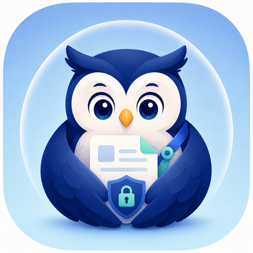
General version
mascot-owl-source.png
| Element | Meaning |
|---|---|
| Navy base | Trust, calm, watching at night |
| Wings cradling a document | ”Guarding knowledge,” “passing to the next judgment (= tasuki)“ |
| Shield + keyhole on chest | Security, permissions, tenant isolation |
| Background circular barrier (pale blue) | Protection, safe zone |
The composition compresses Tasukiba’s design intent into one image.
Derivatives:
| File | Use |
|---|---|
public/mascot-owl.png (512) | Header logo |
src/app/icon.png (256) | Favicon |
src/app/apple-icon.png (180) | apple-touch-icon |
public/og-image.png (1200×630) | SNS share OG image |
Chat version
mascot-owl-chat-source.png
| Element | Meaning |
|---|---|
| Owl inside a speech-bubble outline | Instantly communicates “the chat partner is the Tasuki Owl” |
| Mint tasuki band | Inheriting the service-name + relay-baton symbol |
| Small shield (with check mark) | Visualizes safety against cross-chat / tenant leakage |
| Same blue palette | Maintains continuity with the general version |
Derivative:
| File | Use |
|---|---|
public/mascot-owl-chat.png (256) | Chat FAB + assistant avatar |
Why a chat-specific composition
A regular logo:
- Reads as a static symbol, doesn’t convey dialogue
- Doesn’t make “what happens if I click this” intuitive
With the speech-bubble outline, the owl:
- Reads as “chat = dialogue” at a glance
- Reads as a clickable button
- Carries the character “the one you’re talking to is the owl”
— different UI role, different visual. Same root as “UI = API authorization equivalence” in B-4 — the UI doesn’t lie.
SNS version
mascot-owl-sns-source.png
For the official SNS profile (X / LinkedIn / Facebook). No code reference; uploaded manually by a human.
Characteristics:
- Designed for circle cropping, center-weighted
- Face close-up
- Background barrier accepted to clip off
No derivative images are generated. The SNS master gets uploaded as-is.
Derivatives mapping
| Derivative | Use | Master |
|---|---|---|
public/mascot-owl.png (512) | Header logo | General |
src/app/icon.png (256) | Favicon | General |
src/app/apple-icon.png (180) | apple-touch-icon | General |
public/og-image.png (1200×630) | OG image | General |
public/mascot-owl-chat.png (256) | Chat FAB / avatar | Chat |
Five derivatives cover logo / icon / OG / FAB.
Recommended use
Header logo (top left)
- Desktop: “icon + Tasukiba” combined
- Mobile: icon only
- Image:
public/mascot-owl.png
favicon / apple-touch-icon
- Next.js’s
src/app/icon.png/apple-icon.pngconvention auto-serves these - Developer just places the files; Next.js generates the
<link>tags
OG image (SNS share)
public/og-image.png- Logo on left, service name + tagline on right
Chat semantic search FAB
- Bottom-right floating button
- Image:
public/mascot-owl-chat.png aria-label: “Talk to the Tasuki Owl”, fixed
Official SNS accounts
- X / LinkedIn / Facebook
- Manual human upload (no repo reference)
What to avoid
Don’t:
1. Over-deformation / animation
Hurts enterprise trust. Tilting toward “cute” thins the business-SaaS firmness.
2. Low contrast against the background
Don’t place a navy mascot on a dark background (visibility drops). Use light or pale-blue / white backgrounds.
3. Metaphors unrelated to permission / security
Don’t use it in pure “entertainment” or “lightness” framing. That diverges from the guardian metaphor the owl carries.
4. Anxiety / warning contexts
Don’t use it for errors or warnings. That contradicts the guardian role. Use a different icon (e.g. AlertCircle) for errors.
Copy direction
When the Tasuki Owl appears in marketing copy or service introductions, anchor on three contexts:
- “Watching at night” (continuous monitoring)
- “Guarding knowledge” (data preservation, knowledge accumulation)
- “Showing it at the right moment” (suggestion engine, judgment support)
Diverging mascot copy blurs brand image. Sticking to three contexts makes the impression durable.
Summary
| Master | Use | Derivatives |
|---|---|---|
| General | Logo / favicon / OG | 4 |
| Chat | FAB / avatar | 1 |
| SNS | Official SNS | 0 (manual) |
Optimal composition per use, five auto-generated derivatives plus one manual upload. Brand consistency without sacrificing per-context optimization.
Tomorrow closes the series’s first half: a six-month retrospective on launching a SaaS solo. Hopefully useful as a reality check on effort for anyone considering indie SaaS.
Related posts
- Four mascot candidates — why the Tasuki Owl won — series part 18, mascot selection
- Meet the Tasuki Owl — why Tasukiba’s mascot is an owl — the three owl symbols
- Return autonomy to the user — a UI with no gatekeeper — root of “the UI doesn’t lie”
About Tasukiba
The Tasuki Owl shows a different face on the product page and in articles.